evoila with new brand identity

We are happy to announce the launch of our new evoila logo as part of the continuous development of the evoila brand.
In the history of any company, there comes a moment when you need to take a closer look at who you are, or better, who you have become, and make this also visible to others. This point in time has come to evoila a few months ago, and our creative marketing team has been busy updating our visual identity to reflect what we are now and how our company approaches many things these days.
If you’ve paid a little attention lately, visually we’ve become bolder, sharper and more focused.

Why is that?
At evoila, we’re a team that excels at expertise and agility, and we like to transmit that in our aesthetics. In addition to unifying our logo variants for internationalization, evoila has also become a word mark.
The surfaces of the new key visual form dynamic platforms in their basic shapes, in the connection of which something new is created.
The connection between our employees (green) and our customers (blue) creates evoila solutions (light blue). Innovative technology meets expertise, and the intersection creates evoila performance.
Does that sound like more?
We think—yes!
In this sense we are very happy to continue to live and develop the evoila performance with you, our customers and partners and our team.
Relevant posts
Growing together – COPiTOS becomes part of the evoila brand
Mainz / Frankfurt, July 16, 2025 – After more than two successful years as “COPiTOS – part of evoila”, the...

Press Release: evoila strengthens European presence with new office in Spain
evoila is continuing its European expansion strategy MADRID, May 12, 2025 – The internationally active IT company evoila is continuing its...
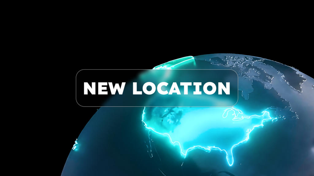
evoila Expands to North America with Launch of evoila US; Names Technology Industry Veteran Glen Tindal as CEO and Managing Director
Mainz, 3 February 2026 – evoila, a leading Broadcom Pinnacle Partner specializing in enterprise infrastructure solutions, today announced its expansion into...

evoila Wishes You a Merry Christmas 2024 and a Happy New Year
A moment of gratitude and a small gesture with a big impact Surrounded by the hustle and bustle of the...
Press Release: evoila Expands to Italy
evoila continues its European expansion strategy ROME, September 4, 2024 – evoila announces the opening of a new location in...
evoila and Carahsoft Partner to Deliver Consulting, Training, Development and Managed Services to the Public Sector
MECHELEN, Belgium, and RESTON, Va. – May 7, 2026 – evoila and Carahsoft Technology Corp., The Trusted Government IT Solutions Provider®, today announced...
You need to load content from reCAPTCHA to submit the form. Please note that doing so will share data with third-party providers.
More Information